Getting this Dead Weight Off My Chest
I love game jams, this was maybe my 10th one or so. Every time, every single time, I say “okay, don’t overscope, and don’t over polish.” Every time, every single time, I overscope and spend way too much time on polish. This was no exception.
Some day, maybe, I’ll do a jam where I’m not learning a new engine and/or pushing the engine to its limits. In this case it was the former. In the fallout of Unity’s implosion, I was really tempted to switch engines and landed on Godot after spending a lot of time eying Strife and of course Unreal. I spent a week completing a Udemy course, finishing up Thursday night hours before this jam’s theme was announced. In that brief period of time I actually looked at all six of the possible themes for the jam. I figured it could help me hit the ground running with an idea right away.
The possibilities were Broken Physics, Dark Science, Cheat, Giant & Tiny, Opposite Rules, and Mirror Realities. Honestly the one I hated the most was broken physics, apparently I had voted for it. Oops! All of them brought to mind some kind of platformer involving two different dimensions, something along those lines. An idea that’s been banging around in my head for years is a platformer where you have to swap back and forth between two dimensions/universes with different layouts and use momentum from movement in one to advance in the other, swapping mid jump and stuff. It could be bent really easily to fit any of the six themes, so I kind of let that initial brainstorming end there. A movement mechanic in that proto-idea was to have a jetpack for an interesting way to do jump mechanics that give the player a lot of freedom in solving problems.
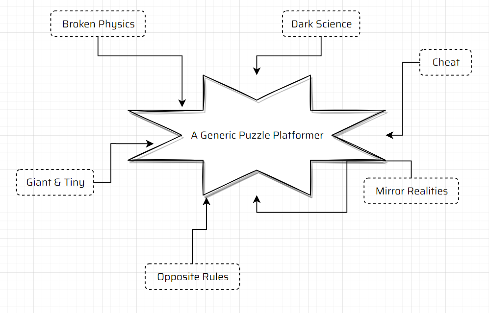
The theme was announced (broken physics) at 2am my time, and after playing with ideas for a bit in my head I went to sleep. The first thing that came to mind was how much I was hearing about 2d physics in Godot 3.5 being “basically broken”, and how it was mostly fixed in 4 - and I thought “if I make a game that uses physics but is broken, that fits the theme right?” A joke, sure, sorta. But I knew I wanted to actually try to make use of a physics engine, and figured even in this jam that would not be super common to see. In retrospect I was absolutely correct in my judgment - only a few games this jam ended up having anything to do with interacting with a game’s physics engine.
From there it was straightforward to come up with the idea for Dead Weight. It basically started with “what can it even mean for physics to be broken”? It first made me think of things like Manifold Garden and Miegakure, which were ideas too ambitious and smart for my little brain, so otherwise it’s “physics works in a way we don’t expect.” From there, I wondered narratively “what situations can cause physics to break?” The idea of a spaceship/spaceship that normally rotates in order to simulate gravity then breaking immediately came to mind. Navigating movement without gravity is an idea I haven’t seen a ton of games explore, maybe I’ve been looking in the wrong places. Something that would very naturally fit in that environment? Using a jetpack to move. My initial pre-planning bore fruit, this was the idea for me.
Of course, just navigating zero-gravity with only a jetpack for movement wasn’t enough to make an interesting game. While it’s a much more common idea, I really do find moving around through firing a weapon to be an interesting mechanic, and the idea of a gun as another, potentially primary form of movement was locked in. Another form of movement that seemed to make sense to me mechanically was a grappling hook, something else that had come up in my “actually using a physics engine” part of brainstorming. I didn’t go that route, but the idea of being tethered to something brought me to the core actual spice of my game - what if you were tethered to something you need to move around while stuck in a situation with broken gravity? Suddenly issues of managing momentum, learning to move efficiently, and controlling your movement felt a lot more compelling.
I knew I could easily head down the dark road to the rage game place where Umihara Kawase and Getting Over It dwell, so I tried to keep in mind my golden rule for game jams - if by the end you think your game is too easy and are considering making it harder, it’s still too hard, make it easier instead. I still failed at that, but more on that later.
It also seemed to me to be a game well within my capabilities to make within the jam period, so I decided to explore it right away. By mid day friday I had a prototype using Kenney’s platformer pack up and running in Godot and was having fun just moving around my super simple test environment, and decided this idea really was going to work. One of the most repeated pieces of advice I’ve seen when it comes to games, and one I strongly, strongly believe in, is that the most basic action in your game should be fun enough to stand as its own experience in and of itself.
A platformer where the character is unresponsive and the jump is floaty is not fun to move around in, it’s actually really tedious. It doesn’t matter how interesting your puzzles are, if I’m bored moment to moment it’s not a good game. Celeste and Ori are a couple of games that really understand this, both are a joy to just move in. Other genres have maybe different standards for that, but it is something a large majority of games fail at, I think. It is really satisfying to start with the most basic sketch of a prototype and then spending minutes enjoying just playing around with it. The jam started off amazingly well for me, I think.
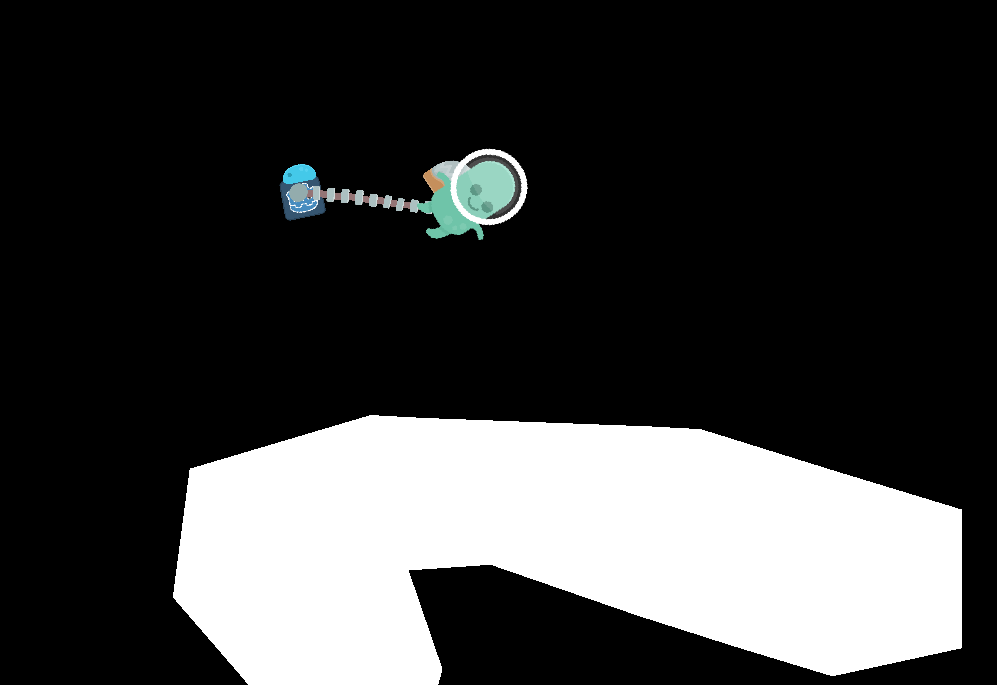
This year I taught myself how to draw (after learning how to be mediocre at pixel art last year), and knew I was going to want to make my main characters with it. To match the vector art style of Kenney’s basic platformer, I figured it was time to learn how to do vector art myself… and so my tolerate/hate relationship with Inkscape was born. Making the air tank robot took a while but I am really pleased how it came out, my first effort with the program. I’ve always really found Henry Hoover vacuums to be stupidly cute and was largely inspired by them, but also I pretty quickly added in having its eyes follow the cursor around. Animating it was a chore with Inkscape, though, and that’s where I began having it crash on me multiple times a session.
It didn’t feel horribly out of place following around the little green alien in a helmet from Kenney’s pack, and I set out to figure out how to map my game. I was planning on using polygon2ds and the path tool in Godot to create chunky, organicish looking maps that don’t have the rigidity tilemaps have, but I really struggled to make them look good and tools like SmartShape2d weren’t working for me. The other big issue, of course, is that I just spent a bunch of time making a vector art character I really liked the look of and most tilemaps out there are done in pixelart style. I was struggling to make Kenney’s platformer assets actually work for me beyond prototyping. I really lost a lot of time asset hunting this jam, I tried to keep to CC0 assets just to make life easier, and eventually found a couple pixel art options I thought were promising,
With PiXel ScaLer I converted them into looking more like vector art, and landed on one I thought could look okay. Built some test environments, felt like things were satisfying, and began working on UI.
Mechanics wise I liked the idea that shooting your robot would be costly, so you had to be really careful where you aimed your gun, I imagined a cutscene where the first time you accidentally hit the robot he’d say “hey watch it!” and teach you the mechanic that he had recharging shields, so actually you could shoot him once in a while if you needed to.
I tried various shaders to make a good outline effect for it work, but I had clipped the sprite pretty close and was having issues of things wrapping around weirdly and leaving unsightly visual artifacts. So I scrapped that visual effect, decided I’d come back to figure out how to implement the shield later (spoiler alert: I did not).
This did lead me to narrow down the various resources I had in mind for the game. Water as the justification for why the thing that supplies oxygen needed to be a silly robot (cause, uh, it converts water to oxygen, a totally great idea!), and the idea of spraying so much extra air into the suit that it causes the jetpack to work seemed cute to me. I knew I wanted the gun to have some sort of resource attached to it too, and the idea of power being another key resource was an easy decision. Eventually this narrowed down to water for the player health and jetpack, energy for the oxygen tank’s health (to recharge the shield) and gun. I felt like this was a fairly elegant solution that kept things from getting too complicated. It could’ve been you need oxygen to stay breathing, medkits to heal after being hurt, fuel for the jetpack, bullets for the gun, and then energy for the shield and I’m glad I didn’t go that route. I was afraid of water and power becoming just “blue meter” and “yellow meter” and decided to have different mechanics around them, which I think have some decent interest in them.
So I knew I had to make some UI to communicate these things well to the player, and spent a lot of time on the various animations and such. I think I ended up with something pretty great. I really like the batteries, a lot of time and effort was spent making sure as you unlocked more batteries they’d line up properly and still work together. Glad I didn’t have time to make it so you can actually get more batteries!
This is a problem I have with jams and stuff though, in that I really am not comfortable using placeholder/”programmer” art, especially for things like UI. If I’m going to take the time to program UI, so much of that is tied to specific implementation of the element, so I just do the whole thing all at once. It’s probably not good use of time in a jam, really, though I think minus some alignment issues the UI came out really, really great.
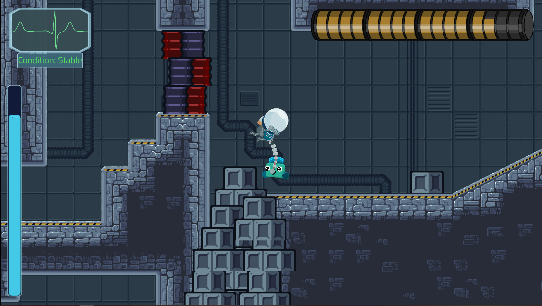
The polish the UI brought combined with my little robot looked so much better than the placeholder art I was actually using, so I then felt compelled to try to create my own astronaut type character. I found the idea of the inanimate helper robot being more full of life and character than the player character amusing and cute, so I chose to hide their face (also makes animating easier). This is where I think I made my first major fumble in the jam.
I knew Godot supported bone-based animations with inverse kinematics - I tried making it work for the hose that connects the player and the robot, but realized it would always look too static compared to the segments of rigidbodies that I went with. I figured I could make the bones work to animate the player’s arms and legs. Big mistake. This cost hours of tweaking, and skeleton2ds are not well supported in Godot 4. They constantly spit errors to the console, and I suspect (hope) it was the reason I had Godot crashing on me every few hours from that point on. It was really a drag, especially with Inkscape doing the same.
I animated the breathing animation for the player by eyeballing the frame changes in inkscape without previewing it, and I’m really happy and proud of how it turned out. The whole animation cycle of the air tank, hose pieces, and suit breathing together I’m really happy with.
My second big fumble was spending all my working time on Wednesday on the intro screen, and then basically all of my working time on Thursday on the main menu. The game absolutely doesn’t need both, and they were far too time consuming. The intro screen saw me once again battling with skeleton2ds and such to try to find a “simple” solution to animating the hose between them, when eventually I had to just stick to using what was already working.
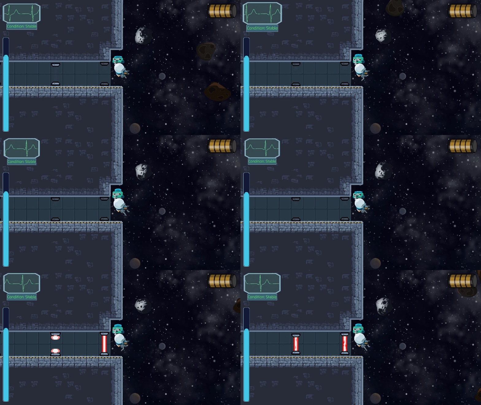
Thursday’s menu was also a lot of tweaking and messing with things and getting the right sounds and shaders and animations in place to sell a feeling. I really liked the tonal whiplash of the goofy intro followed by sorta horror vibes. I thought it’d be an effective way to tell the story that you were on a ship that was going down without having to spell it out for the player (uhhhhh, more on that later lol). It’s not all I got done, though, I did waste several hours trying to find good asteroid art, finding a low poly model I thought was okay, pixelizing and then upscaling it, and putting it in the game only to realize it really, really was clashing visually and I ended up having to draw my own anyway.
Friday’s where things really came to a head, as I realized just how far behind I had fallen. I had a great UI, decent main mechanic, and characters animated and looking good. Just about finished the main menu, and then I wanted to add screenshake (and the ability to turn it off for those sensitive to it), and other saving/loading mechanics. I worked out what I think is a really cool screen transition, and got pickups functional, and sound going (and all the time finding sound and music). The last piece I felt needed to fall into place was to have interactable objects and a simple dialogue system; I figured I could get that done by the end of Friday and have two full days to, you know, actually make the game part.
And that’s probably the third and largest mistake came in, trying to use the asset library in Godot to just plug in something someone else had made. I could’ve programmed my own dialogue system, but used Dialogue Manager and took a full day to wrap my head around it and style it to look acceptable and ultimately ended up having to write enough code that had I just made a dialogue system myself from scratch it would’ve been far faster.. There’s an interactable item asset as well I tried out, and it led to a bunch of crashes and bugs, so I ended up having to write that one myself from scratch on Sunday.
When I finally, finally got dialogue working, I wrote the computer intro to sort of test it out and probably (objectively) made that take too long. I then had to rework stuff to plug another scene into the flow, and meanwhile the list of easy tasks I needed to do was monumental.
So Sunday comes along, and I had finishing tweaks to do on the dialogue to make it at all functional, and I decided to get the step by step tutorial I had been planning implemented before at least spending a few hours slapping some quick levels together. I’d been pulling long days from thursday onwards and was really running low on energy/concentration, I think, but mainly stuff just took a long time. One thing I think I did really right was to make sure building the game worked early in the day (and that had its own couple hours of troubleshooting thanks to GDExtension issues), it was nice to get that out of the way and be able to just focus on the endless tasks I had left for myself.
I made it so you can interact with objects that prompt it, I got my (overly?) thorough tutorial implemented with all the state changes that required, I created the ability to save and respawn at a different point, to press R to restart, and for it to remember if you’ve gone through the tutorial or not when you return to the game. I intended to fix the asteroid spawner I added days earlier but didn’t really have time. I added in the laser traps, the computer to disable the laser barrier, and test that things still basically worked. I made the gun pickup work to unlock that ability. I did take some time to put in an “easter egg” of sorts, an area that says hi! :) and that’s about it.
I had long known my plan was to start the player with just the jetpack and turning, make them cross a somewhat easy asteroid field to get to another room with a simple timing challenge that would also serve as kind of like this section of the game’s hub, from there a small challenge to unlock the gun, which then would allow you to go a bunch more places. I messed up implementing the timed lasers - I thought they were only active for 1 second, each, but they were set to 3 seconds, and one of them is on a 4 second timer. I think it might be literally impossible to get the gun in the version of the game I released, which is a shame, because it’s a key feature for making movement fun and not frustrating.
Throughout the week a lot of my time really was spent tweaking the movement and physics, making sure the damage system worked right/intuitively (it still doesn’t), and making it a fun game to move around in. Instead, things aren’t super well balanced, the asteroids are too intense and too many, the laser challenge is seemingly impossible (if anyone gets past it I’d be super impressed!). And, well, I really didn’t leave myself time to put in much game. I did make sure I made the game easier to control on Sunday, and reduced water and energy costs of everything to a more fun/balanced place (and they’re still probably too high!). So at least I got that part sort of right.
Another day and I would’ve had several kind of rooms/levels, some major bugs fixed, balance tweaked, and had something I could unequivocally say is the best game I’ve ever made. It still probably is. At this point I really have put in every system needed for the game to be fully built as a several hour long (if not 10-20 hours long) experience. Great news for future me, as I do want to continue working on the game, but I definitely did not get the version of it I was hoping to finished in time.
I still think there’s quite a bit of game in what I released - just the challenge of crossing the asteroids, learning to navigate, all that I think feels like it’s in a decent place. In general the art, the atmosphere, the animations, in general I feel like I delivered a really solid experience that I hope people enjoy. I just, like always, wish I could’ve given them the version I had been playing in my head the whole time leading up to it.
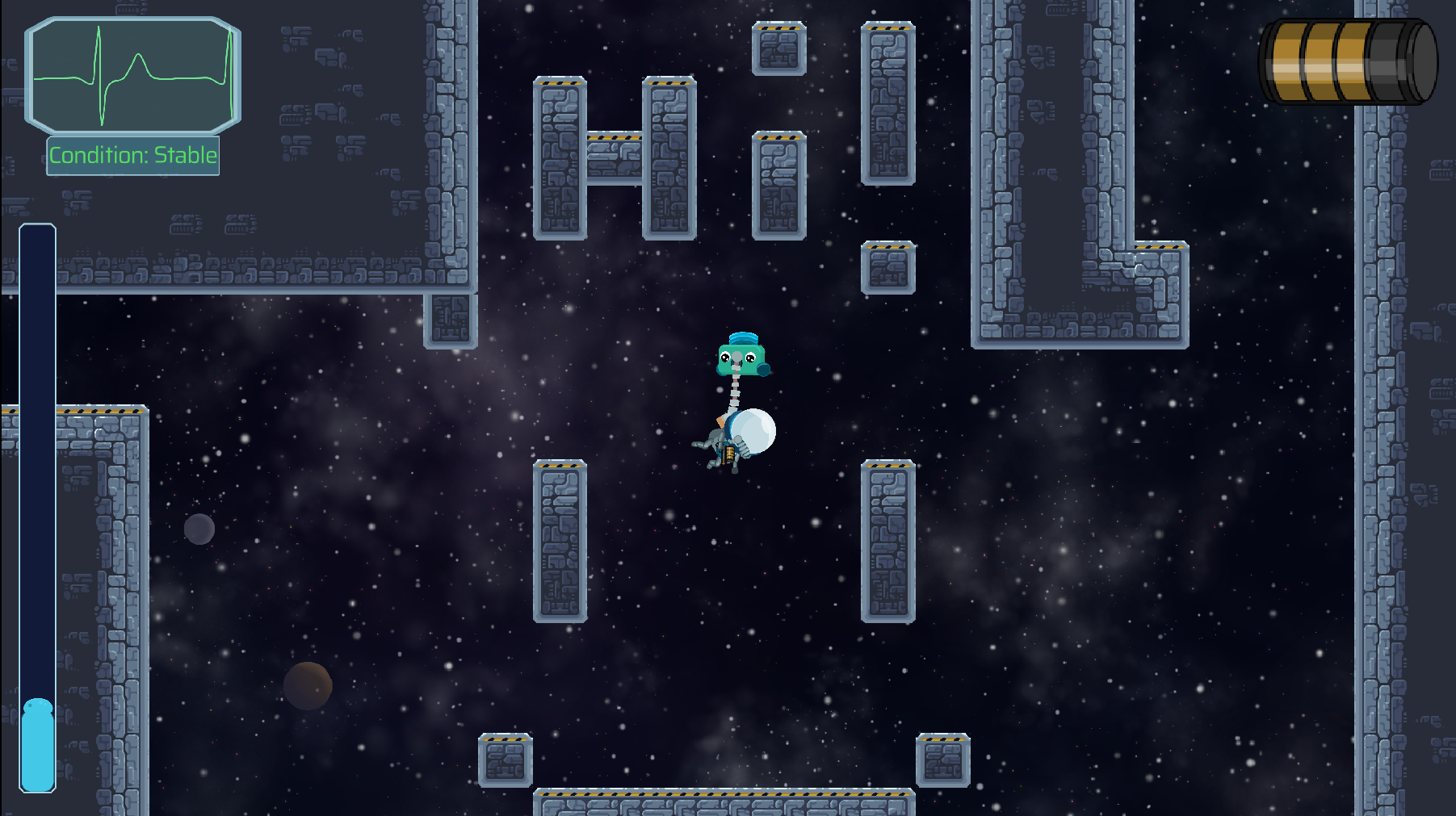
I don’t know if I’ll ever truly learn my lesson about prioritizing better in jams. Having a fully functional game loop including pausing is extremely important to me as a baseline, and I think prioritizing accessibility features like making screenshake optional are too important to me to compromise on. I really, really enjoy things like tweaking UI animations and such. I think it maybe should be my last solo jam, since my focus and approach really is antithetical to the jam experience. But I sure had a lot of fun, feel like I’ve got a decent mastery of Godot at this point, and have a game prototype to polish up and maybe turn into a thing. I needed to do something to get me excited about making games again and this did it in a big way. I hope everyone else feels as energized and great about the experience as well!
Get Dead Weight
Dead Weight
🏆 Best Art 🏆 Best Sound
| Status | Prototype |
| Author | ephemerald |
| Genre | Platformer, Puzzle |
| Tags | Funny, Physics, Space, Zero Gravity |
Leave a comment
Log in with itch.io to leave a comment.